In the previous article in this series, I gave some details on how to build the matrix to import in the software application. After that, you can visualize the network in a graph, where you have nodes and edges.
Nodes are the elements that you analyse: they can be displayed as dots, or in other shapes such as hexagons and triangles. Edges, or ties (in an undirected network), are the links, the lines connecting the nodes: they link each pair of nodes that share something.
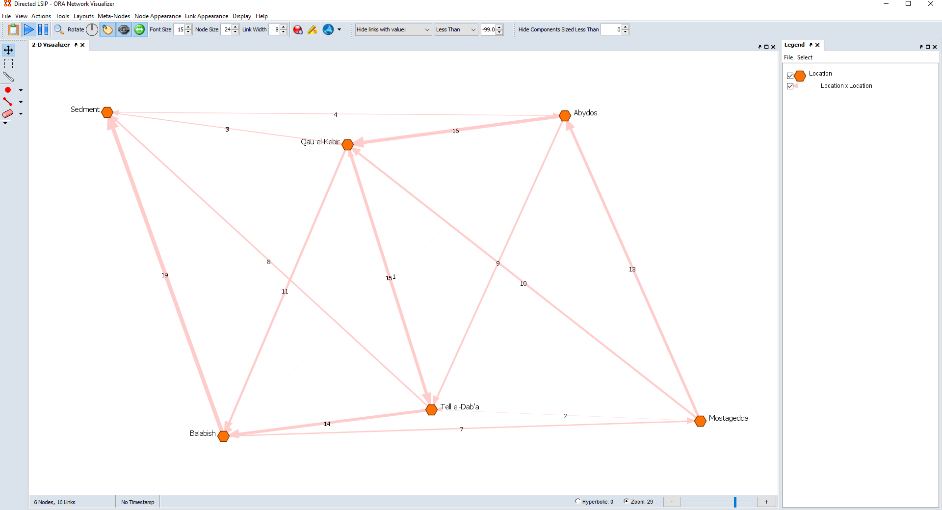
In other words, the nodes display what is at the head of the rows and of the columns of the matrix, while the edges display what is in the cell. In a directed graph, the edges are called arcs and look like an arrow, pointing from the sending node to the receiving node, as shown in Figure 1, below.
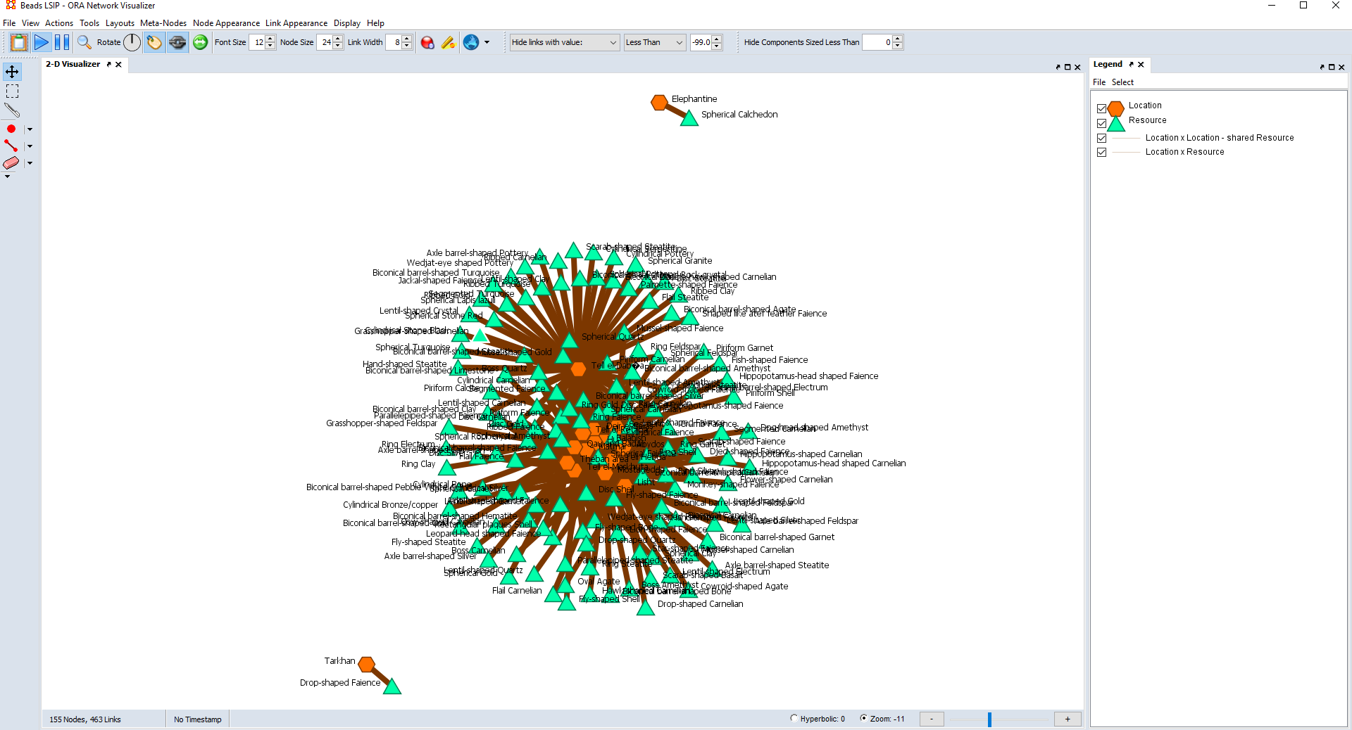
Often, the network displayed in the graph is at first illegible or not very informative, as shown in Figure 2, below. However, a variety of tools allows you to manipulate the graph, making it more intelligible and informative. In my experience, what you should deal with first is the layout of the graph, which affects how you visualize the overall shape of the network.
It is not always necessary to modify the default layout. For example, in ORA, the layout used in the graph makes the network already quite clear, because it is force-based, i.e. based on the overall number of connections a node establishes, and on the strength and directions – for directed networks – of the connections. This allows you to have a quick impression of how central a node is in a network and of what kind of relationships it establishes.
If that does not suit the needs of your research, software applications offer more options for layout. For instance, if you are more interested in hierarchies or how elements depend from each other, you can opt, for example, for tree-like types of layouts or scatter plots; other layouts based on the hierarchical position of the nodes are also available.
If you want to focus only on the edges, and not display the position of nodes in a network, you can choose a circular type of layout; other layouts are also available, that allow you to focus on the edges or on specific measures. As mentioned in a previous article in this series, Gephi offers more options to fine-tune the layout.
Modifying the edges
Once the layout is established, you can work on manipulating the appearance of the nodes and of the edges. There are quite a few things you can do to get a visual impression of the quality of the edges. When representing a weighted network, it is very useful to base the thickness of the edges on the values in the matrix.
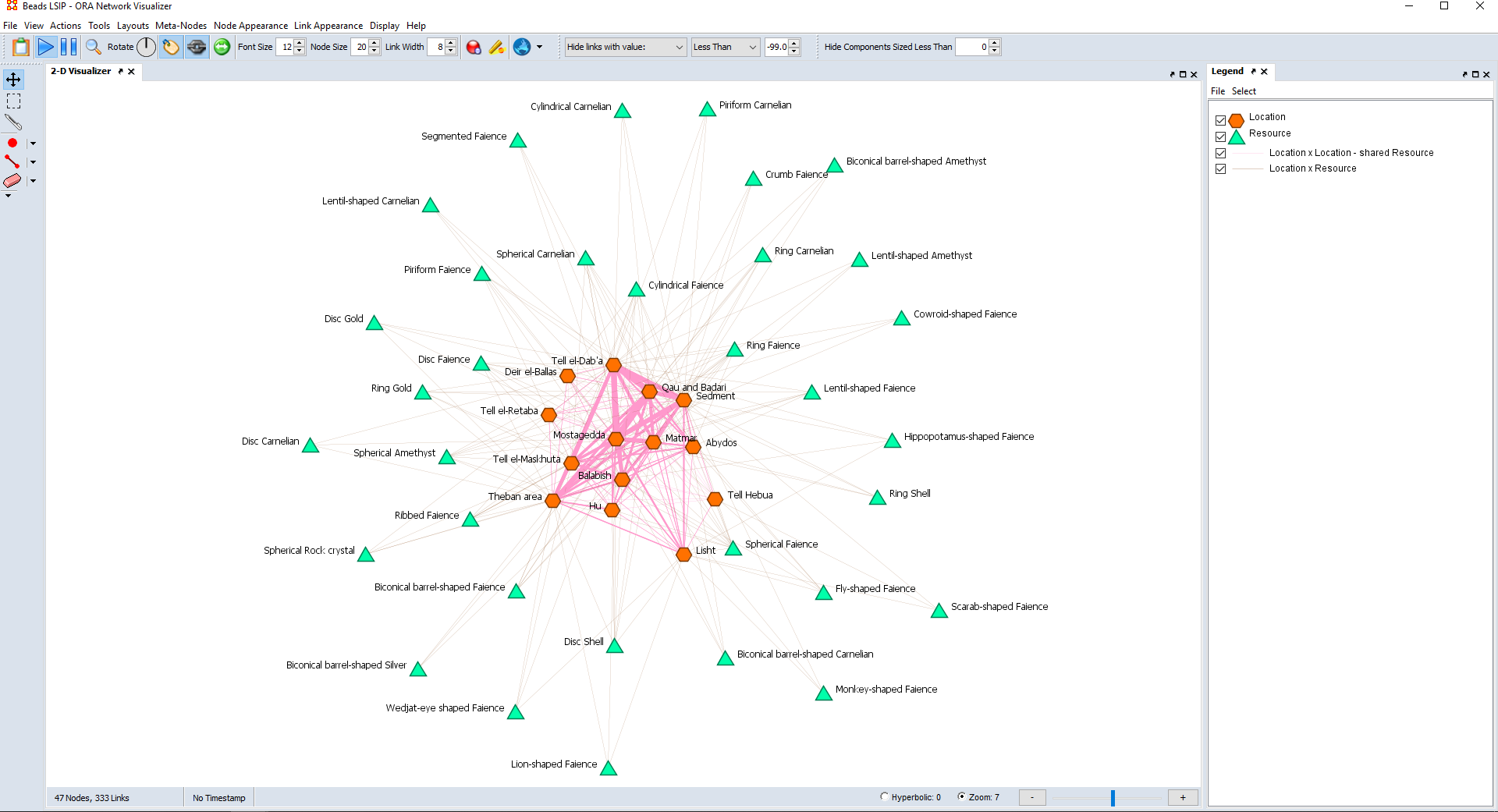
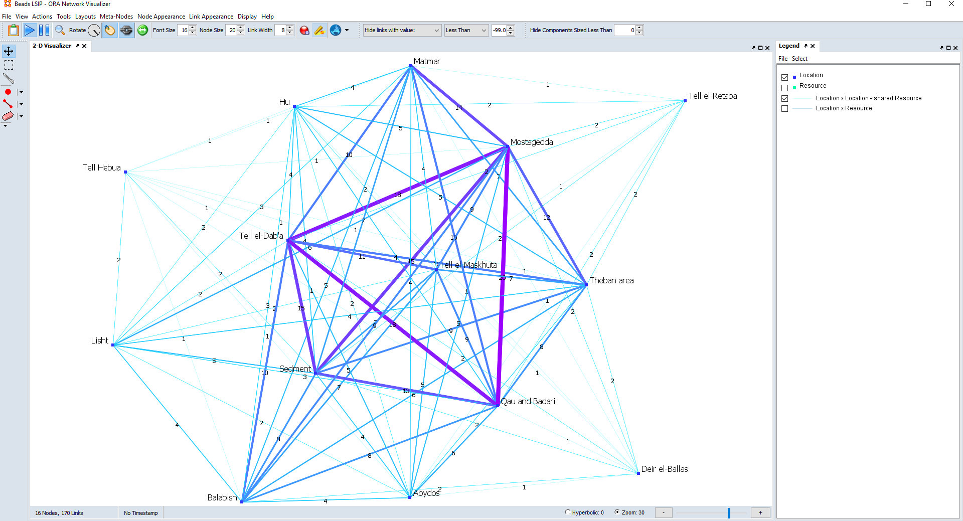
This means that the higher the value in a cell in a matrix is, the thicker the edge representing it in the graph becomes, as shown in Figures 3-6. This shows immediately both which edges are the stronger, namely the ones with the higher values in the matrix, and which nodes share the stronger links. Some software applications, such as Gephi, do this automatically.
The thickness of the weaker edges is proportional to the thickness of the stronger edges. Therefore, you have also the option to scale the size of the edges, meaning that you can set how thick you want the stronger edges to appear, which in turn affects how thick the other edges are: the thicker the stronger edges, the thicker all the other edges become (Figure 5).
Depending on your network and on your graph, you may want to have overall thinner or thicker edges. While for a binary network modifying the thickness of the edges based on the matrix is not informative (because it always corresponds to a 1), it can nonetheless be useful to scale the edges, to make them thinner or thicker depending on your needs.
You can also modify the colour of the edges. For example, you can make links darker based on the values in the matrix: the higher the value in a cell in the matrix, the darker the link in the graph (Figure 4). You can do the same with a colour palette: the values in the matrix are subdivided in ranges, and the edges belonging to a similar range will have a similar colour from the palette.
This is helpful when you want to see immediately which edges have a similar strength. Lastly, another thing you can do is give the links the same colour of the nodes to which they are connected. This is useful when analysing groups and families of nodes, because each group/family will have a distinct colour, for both the nodes and the links (Figure 6).
Lastly, you can display the labels of the edges (Figure 4). In order words, you can visualize on each edge the value that the corresponding cell has in the matrix. While this is useful to further show the strength of the links between each pair of nodes, labels can be cumbersome and make a graph too busy and confusing.
Gephi gives the option to choose a size and a colour for the labels, which you can modify in the same way as explained for the edges themselves. This can help in making the labels less cumbersome and more informative. Lastly, you can make the edges labels display the family/group of nodes that they connect, if you are studying how nodes are grouped.
Modifying the nodes
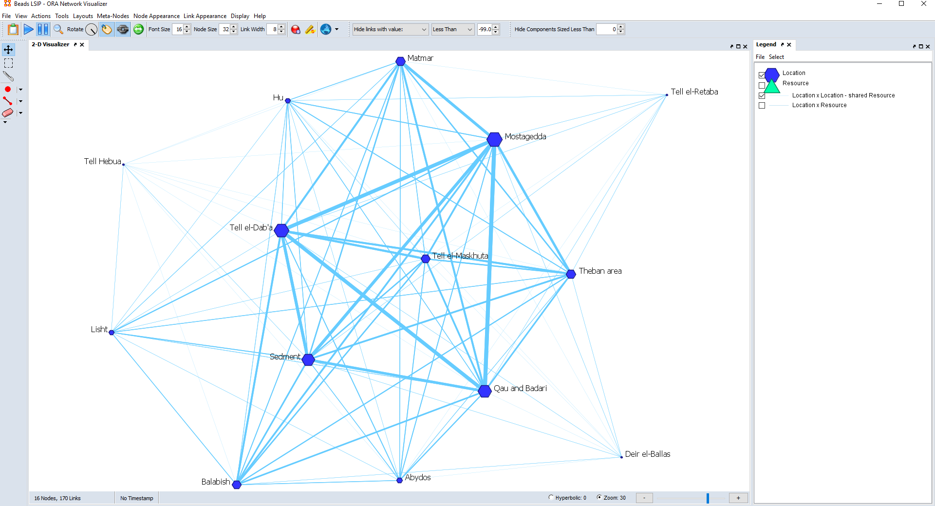
Modifying the nodes is another important step when visualizing a network. The nodes have a default shape, which is circles in Gephi and VISONE. In ORA, the nodes appear by default as hexagons, and in two-mode networks one set of nodes looks like hexagons and the other one looks like triangles.
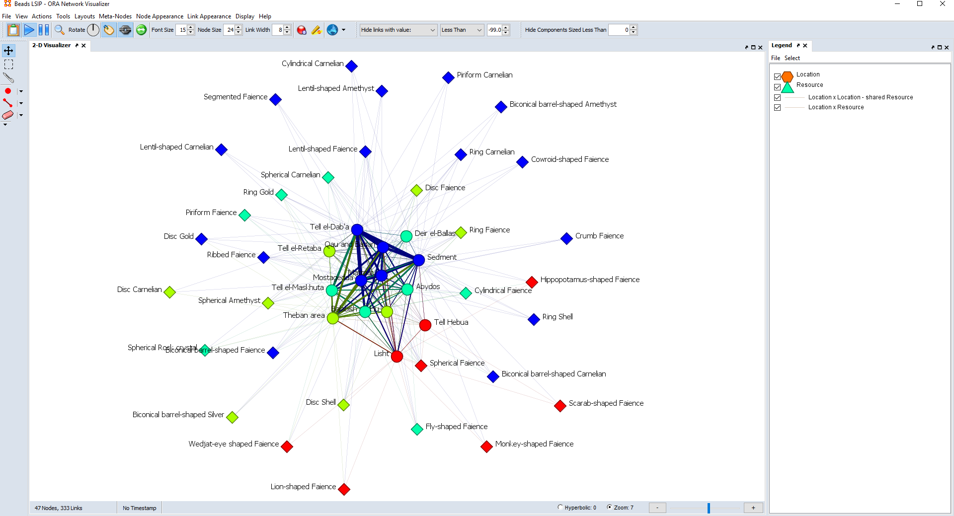
However, you can modify the shape and make the nodes appear like squares, lozenges, or even custom-made images. In a two-mode network, it is useful to give a different shape to each of the two sets of nodes, to perceive immediately to which set each node belongs (Figures 3, 6).
You can shape of the nodes based on specific attributes, for example how big a site is – if that is applicable and relevant to your case – or on how the elements score in a measure. In this case, nodes within a similar range have the same shape: you have an immediate impression of which nodes have a similar range for a particular measure or attribute. You could also base the shape on the families or groups of nodes, if that is what you are analysing: each family has a different shape, and you can immediately recognize the families.
You can also modify the size of the nodes. You can base the size of each node on a particular measure: the higher the score of a measure, the larger the node (Figure 5). This allows to instantly perceive which nodes score the higher for a certain measure. You could also base the size on other attributes, for example the altitude of a site (if you are examining sites in a mountain range, for instance): as discussed with the node shape, in this way you can instantly see which nodes have a similar range. Or you can also base the size of the nodes on the families/groups, though by its own this is maybe not the most useful to give a visual impression of these groups.
As with the edges, the size of the nodes is proportional to how large the largest node is, and you can scale it. You can decide how large you want the largest nodes to be, so that the size of all the other nodes will shrink or expand as a consequence. Therefore, scaling the size of the nodes allows you to decide how crowded, with larger nodes, or emptier, with smaller nodes, your graph is (Figure 5).
Of course, you can also change the colour of the nodes. You can give the nodes a different shade of a colour or a different colour from a palette based on how they score in a measure, or based on other attributes, for example the geographical environment of a site (if this is a factor in your research). This helps perceiving which nodes have a similar range. When you study a two-mode network, it is useful to give a different colour to each set of nodes. It is also very common to give a different colour to the groups of nodes when studying groups/families of nodes (Figure 6). In these cases, you can recognize immediately to which set or to which family a node belongs.
Moreover, you can display the labels of the nodes, visualizing the name of each node. While this helps to know at a glance which element each node represents, when studying large datasets it can make the graph too busy and illegible. It is a possibility, then, to leave the labels completely out.
With ORA and Gephi, you can decide the position of the label on each node (for example on one side, or on top, or on the bottom, or centred) and the size of the label, while with Gephi you can also modify the colour, in the same way you do for the nodes themselves. With Gephi, you can also change what the label displays. For example, instead of showing the name of the element, a label can show a family to which a node belongs, if you are studying how nodes are grouped, or to which set they belong in a two-mode network.
Lastly, you can set thresholds, for both nodes and edges, displaying only nodes whose score in a measure, or some other attribute, and edges whose value is higher than a certain minimum (Figures 3 and 6). Especially in larger graph, this can help getting a clear image, removing “background noise” and focusing on the elements that have a relevance in the network.
Conclusions
In this article, I have described some ways in which you can manipulate how a graph looks. I have also mentioned a few drawbacks and advantages of these modifications. How you decide to manipulate the graph depends on the goals of your study, and on what in your specific case is more informative to show and get an immediate visual impression of. You can display more characteristics at the same time, for example you can base the size of the nodes on a certain measure and the colour on the family they belong to.
One warning to give at the end: there is no “undo” button. It means that once you apply a modification – e.g. you change the colour of the links – there is no going back. You can either keep modifying until you go back to previous conditions or recreate the graph. However, this should not be discouraging. Talking from personal experience, my advice is actually to take your time, especially when you are new to network analysis, to play around with the graph, to try different things out and get experience.
In my opinion, the best way to proceed is to start with a smaller version of your network, or a test version, and work on it to see what modifications are helpful and which are actually an obstacle to your study. So, when starting a new project, I believe that it is useful to plan some time for this step and to first experiment and test out different types of modifications, because only in this way you will be able to understand how to get the best out of the visualization of the network you are studying.